Drift Golf

Year
2024
Industry
Sports + Commerce
North Star
The player tool IS the revenue channel.
Drift wasn't one app. It was an ecosystem that had to feel like one.
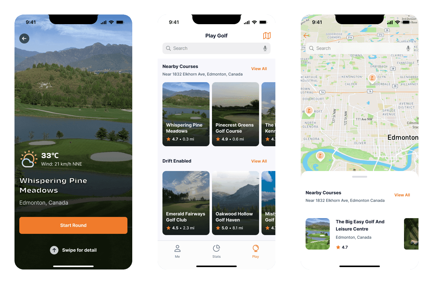
The consumer mobile app handled GPS hole maps, shot tracking, digital scorecards, side game scoring, and on-course food and beverage ordering. The provider mobile app was staff-facing: order management and delivery routing to the cart's GPS coordinates. The admin dashboard covered menu management, POS integration, course analytics, and revenue reporting.
A player ordering a sandwich on hole 7 triggers a notification on the provider app, routes to the nearest cart, and logs revenue in the admin dashboard. Three apps sharing one data model. The design challenge was making them feel like a single product despite serving completely different users with completely different needs.
There was also a hardware layer. A cart-mounted sensor captured wind speed and environmental data at ground level, feeding real-time conditions into the player app while doubling as a GPS beacon for delivery routing. The sensor wasn't an accessory. It was the link between the player experience and course operations.
Golf courses are hostile environments for mobile UI, and most golf apps are designed as if they'll be used on a couch.
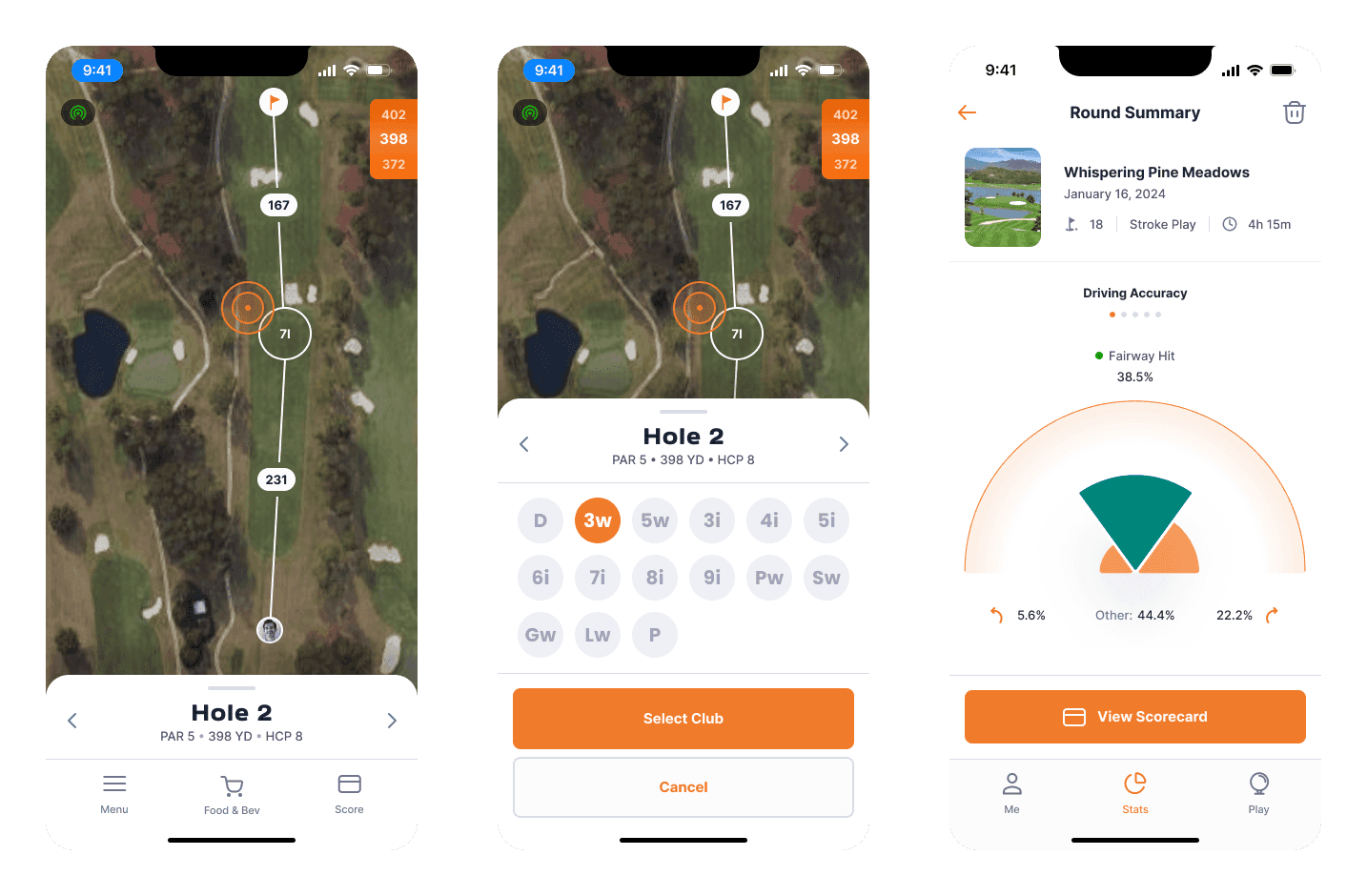
Direct sunlight means high-contrast layouts with no subtle grays. One-handed use between shots means oversized tap targets and thumb-zone navigation. Intermittent attention means nothing should be more than two taps from the active round. Gloves, sweat, and movement mean generous spacing and no precision gestures. Cellular dead zones on parts of the course mean offline-capable scoring that syncs on reconnect.
I stripped micro-interactions, spring animations, and swipe behaviors. The engineering team couldn't deliver them at quality with the timeline we had, and the environment didn't reward them anyway. I focused design energy on what actually matters when you're standing over a 6-iron in July: high contrast, large targets, shallow navigation, and fast state changes.
This was a case where constraints improved the product. The limitations forced every design decision toward clarity, and the result is an interface that works under conditions where most apps fall apart.
Side games are what keep groups engaged over a full round, and they're also what keep the app open for longer than a quick yardage check. Drift supported formats most competitors ignored: stroke play, skins with carryovers, Nassau (front nine, back nine, and overall as three bets in one), Wolf (rotating captain picks partners each hole), Stableford (points-based scoring that rewards aggressive play), and closest to the pin contests.
The breadth of scoring formats wasn't a feature list decision. It was a retention decision. The group that plays Wolf every Saturday has a reason to open Drift instead of their usual app. And once the app is open for scoring, the ordering system is one tap away.
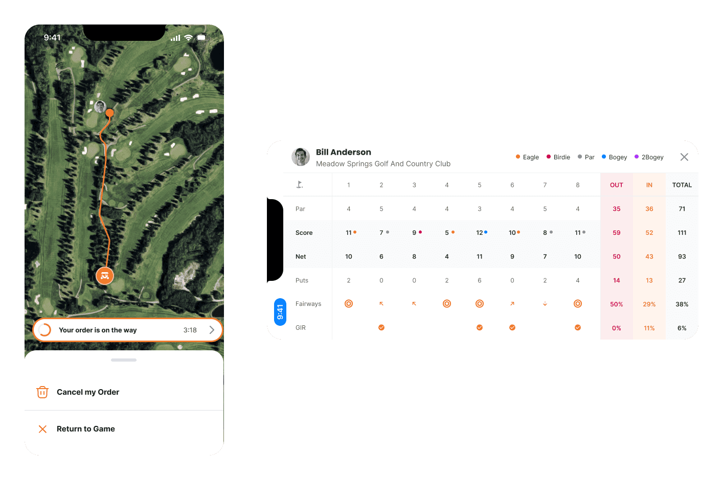
The feature no competitor had: order food, drinks, or merchandise from anywhere on the course, delivered to your cart's GPS coordinates.
This was the business model. Everything else, shot tracking, scoring, GPS, was the hook. The ordering system was the revenue engine.
The flow worked like this: the player browses the course menu, which is managed through the admin dashboard. An order is placed with the cart's GPS location attached. The provider app receives the order with delivery routing. Staff delivers to the cart. No flagging down the beverage cart, no walking back to the clubhouse.
Courses were sitting on untapped revenue that depended entirely on a beverage cart driving past at the right moment. Drift turned that into an on-demand channel that the course controls and the player actually wants to use.
The engineering spanned all three surfaces. The consumer app was built in React Native with GPS-based cart location, an offline-tolerant ordering queue, and real-time scoring state. The provider app, also React Native, handled a real-time order stream with turn-by-turn delivery routing to cart coordinates. The web-based admin dashboard covered menu management, a POS integration layer, order analytics, and revenue reporting. And the cart-mounted hardware integration provided wind speed telemetry, environmental data, and location broadcast over Bluetooth.
The co-founders were non-technical and scope-hungry. Social features, leaderboards, and community tools kept surfacing as ideas before the core experience was solid. Part of my job was absorbing the ideas worth keeping, designing them into the existing architecture without bloating the experience, and pushing back on the rest. In a three-month engagement with a junior engineer, cohesion is more valuable than features.
Drift piloted across multiple golf courses in Alberta. The app was the mandatory scoring and ordering platform for a live tournament. The project secured an innovation grant through Alberta Innovates and earned recognition at SXSW.
The thesis held. Golf apps don't have to choose between serving players and serving courses. If the player tool is good enough to earn daily use, the commerce layer earns the right to exist.
Three surfaces, one system. Player engagement funds course operations, and the app earns its place in both hands.


