Implentio

Year
2024
Industry
B2B SaaS + Logistics
North Star
Turn invisible billing errors into automated recoveries, so e-commerce brands stop losing margin to mistakes buried in thousands of invoice line items.
When I arrived, there was no token layer, no semantic naming, and no layout patterns an engineer could reference without opening a Figma file and interpreting what they saw. Every feature required a conversation about what a component meant before anyone could write a line of code. The design system existed as a visual artifact rather than engineering infrastructure, and it was slowing everything down.
I rebuilt the library with the frontend team as my first customer.
Component architecture. I restructured the Figma library to mirror how components actually compose in code: atomic elements, composite patterns, and page-level layouts with clear boundaries at each layer. A designer handing off a screen and an engineer receiving it should be looking at the same vocabulary.
Semantic token system. I defined tokens by intent (surface-primary, text-muted, spacing-section) rather than raw values. No more looking up hex codes or guessing pixel values. The token names describe what a value does, not what it is.
Shared naming conventions. Components, variants, and states use the same vocabulary in Figma and the codebase. Zero translation layer between what a designer calls something and what an engineer references.
Reusable layout patterns. Data tables, detail panels, form flows, and dashboard compositions became standardized patterns that engineers could assemble without waiting for design review.
The goal was 1:1 fidelity between Figma and code. When a designer hands off a screen, the engineer already knows every component, token, and layout pattern involved. Interpretation drops to near zero, and the negotiation meetings that used to precede every feature disappear.
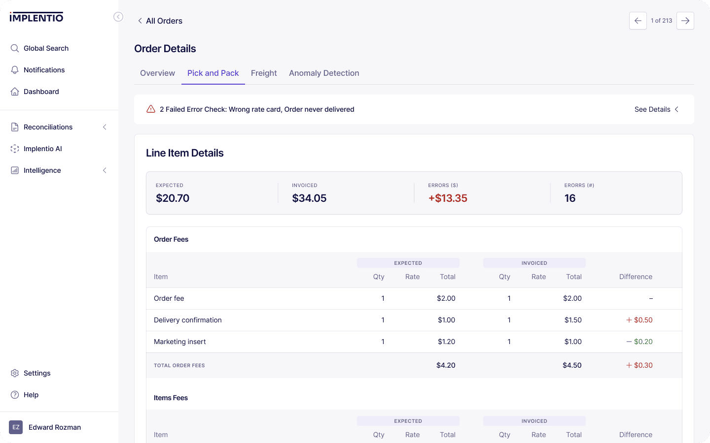

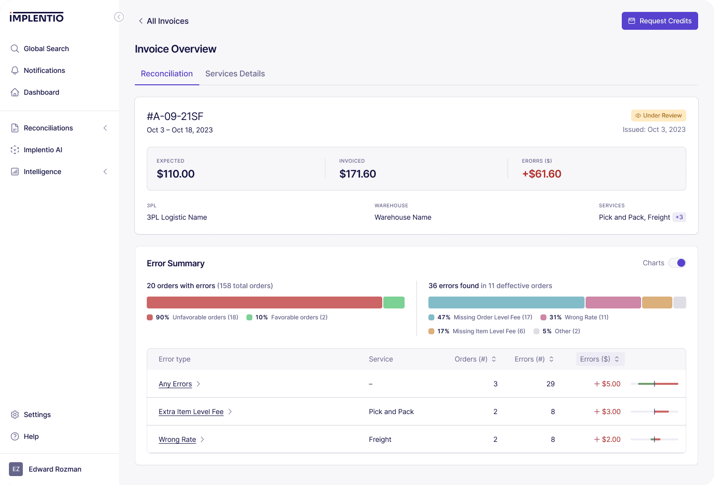
Implentio's core bet is mapping fee sheet rules to raw invoice data with extreme precision. 3PL billing is sprawling: hundreds of fee categories, carrier-specific surcharge logic, agreement-level exceptions, volume-based tiers, and accessorial charges that vary by carrier, service level, and geography.
Getting to 90% accuracy on automated auditing is table stakes. Any manual audit gets there. The last 10% is where the real money lives, worth thousands per month per customer. The precision at the margins is what justifies the platform's existence.
I co-designed the labeling schema and taxonomy with the CPO and CTO, and this was the hardest problem on the engagement. Every label in this system is a training signal for the ML models that power automated auditing. A mislabeled surcharge category doesn't just produce a wrong number on one invoice. It degrades model accuracy across every future invoice that shares that pattern.
The design constraints for the taxonomy were demanding. It needed full coverage of the sprawl of 3PL billing logic across carriers, service levels, and agreement types. It needed enough granularity to distinguish between fee categories that look similar but carry different contractual treatment. Every label had to produce clean decision boundaries for model training. And the schema had to accommodate new carriers and agreement structures without being redesigned.
This wasn't an interface problem. It was a domain problem that happened to live in a product designer's scope because the categorization structure shapes everything downstream.
The original onboarding was a human pipeline. An account manager schedules a kickoff call. The customer sends fee sheets, agreements, and sample invoices over email. A technical account manager writes custom scripts to parse PDFs and CSVs. Data is manually labeled and categorized. Multiple validation calls confirm accuracy. The platform is configured with customer-specific rules. Go-live happens after a final review.
Every step required coordination between multiple people, and delays compounded. Two months was the norm. Each new customer required dedicated personnel for weeks.
I redesigned the flow to flip the ratio from 90% human and 10% software to 20% human and 80% software.
Self-serve data ingestion. Customers upload fee sheets and invoices directly. Structured upload flows guide them through formats and validate inputs in real time.
Automated parsing and pre-labeling. The system parses documents and applies the rules engine taxonomy to pre-categorize fees. Ambiguous items get flagged for human review rather than built from scratch.
Progressive value delivery. Instead of a single go-live event after two months, the platform shows early audit results as data is ingested. Customers see value before full configuration, which builds confidence and momentum through the setup process.
Human-in-the-loop where it matters. The 20% that stayed human was the high-judgment work: validating edge-case categorizations, confirming agreement-specific exceptions, and reviewing the first batch of results with the customer.
The redesign was built to scale. Adding a new customer no longer means dedicating personnel for weeks. Software handles the mechanical work. People handle the judgment calls.
Three months of design work doesn't single-handedly get a company to market. But the infrastructure I built removed specific bottlenecks that were holding the product back. The frontend team shipped faster because they could trust the design system. Onboarding scaled because it stopped depending on people for mechanical work. The rules engine got a taxonomy structured for precision at the margins where precision is worth the most money.
Months later, Implentio closed a significant funding round. The platform now serves brands like True Classic, Magic Spoon, Seed Health, and Nood, with a guaranteed $60K per year minimum recovery for qualifying customers.
Design system, labeling taxonomy, and onboarding pipeline. Three months of infrastructure that removed the bottlenecks between R&D and market.


