Life is Beautiful Festival

Year
2012
Industry
Entertainment + Live Events
North Star
Believe impossible is suddenly within reach

The pitch concept was a raw, paint-splattered heart. Something that felt hand-built and urgent rather than polished or corporate. It connected to the mission, which was love poured into a neglected neighborhood, and to the rough, layered texture of downtown itself. One symbol holding multiple layers of meaning.
The creative relationship was direct: me and the founder, no committee, no rounds of options. That directness is how the identity came together fast and right. The logo became iconic enough that the festival gave out free tattoos of it on opening day, and people lined up.
The brand wasn't applied to the city. It was extracted from it. I studied the actual architecture of downtown Vegas: rooflines, vintage signage geometry, the shapes baked into decades of the neighborhood's surfaces. Those real physical forms became the brand's visual vocabulary. Angular borders, frames, graphic containers that showed up on stage backdrops, social media, printed maps, and merch. If a design element didn't feel like it could have come from those streets, it didn't make the cut.
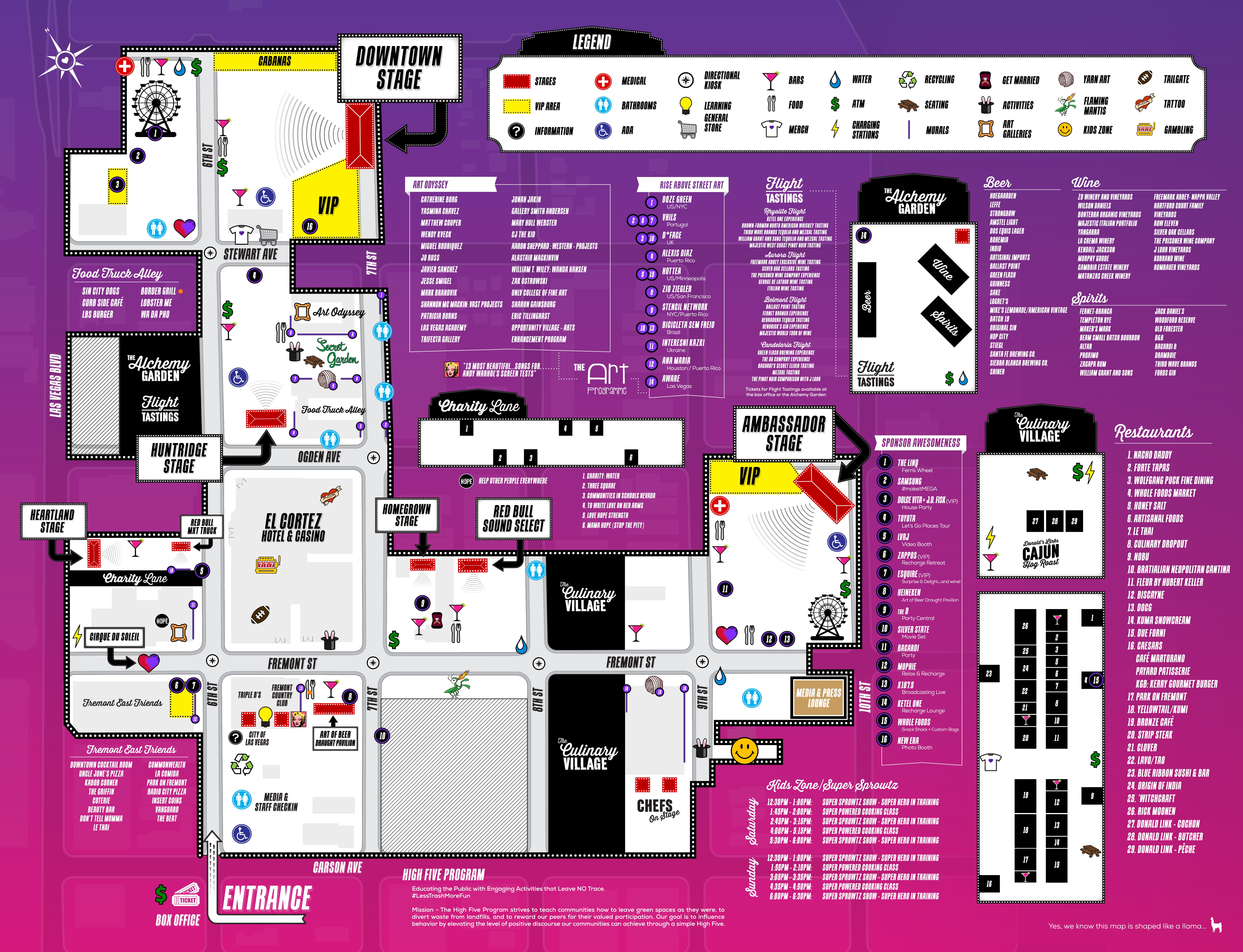
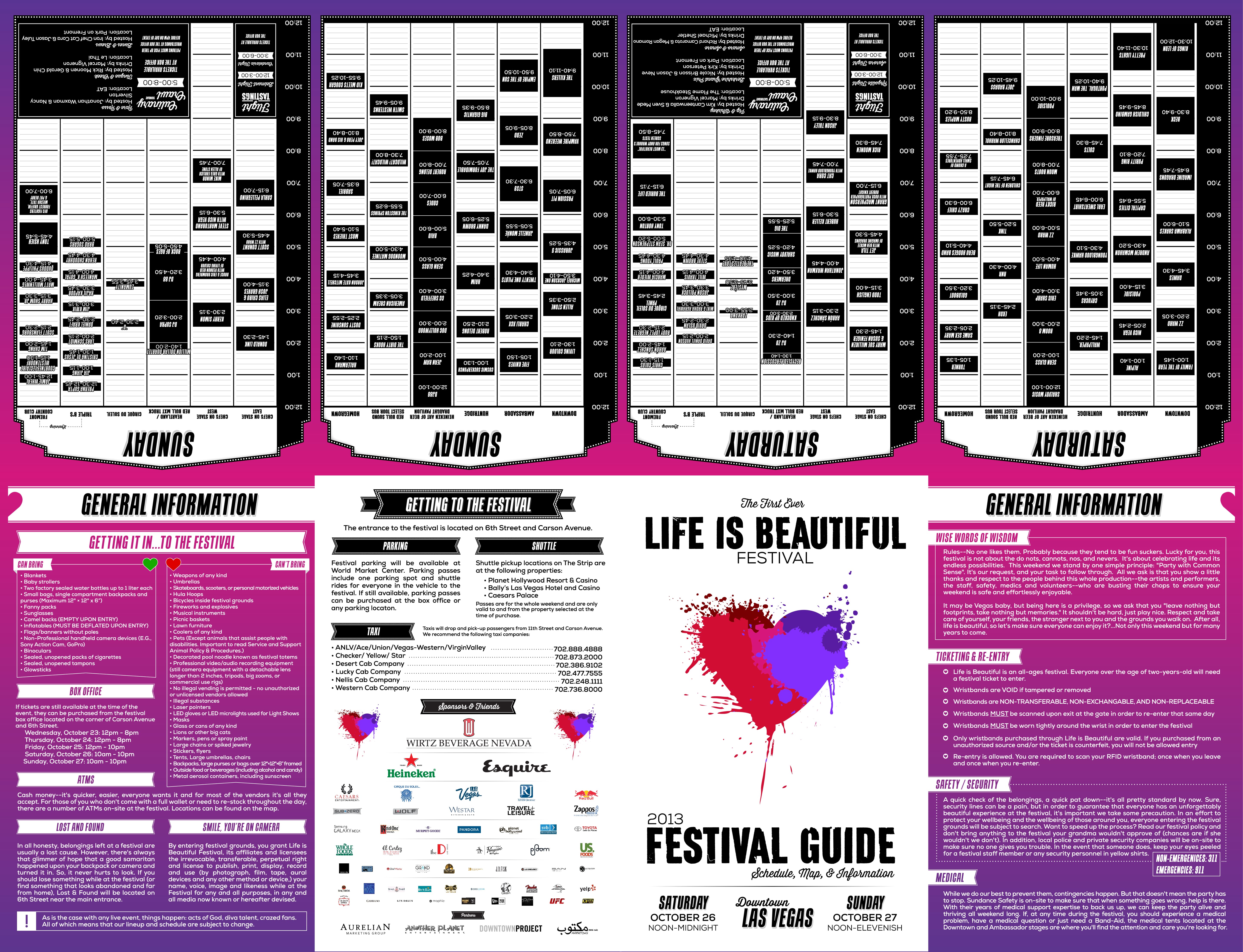
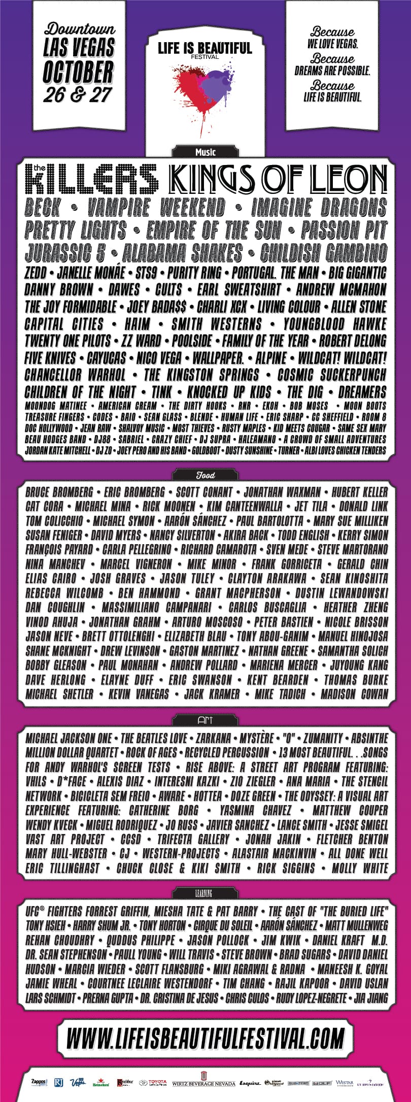
This wasn't a field with a stage. It was 18 blocks of a real city. Streets, buildings you could enter, buildings you couldn't, indoor venues and outdoor stages. The scope of visual production was enormous: over 10,000 pieces of signage including directional wayfinding, informational displays, stage graphics for every performance venue, maps, environmental installations, wristbands for 70,000 attendees, and a full merchandise line of hats, shirts, and posters.
The timeline didn't allow for the typical brand rollout process. There was no opportunity to spend weeks building a 40-page brand guidelines document and then hand it to a production team to execute. The design system, the rules governing how thousands of visual pieces held together across a sprawling physical environment, had to be developed and applied simultaneously. Every decision about typeface hierarchies, color usage across indoor and outdoor contexts, template structures for rapid production, and stage-specific treatments had to be made in real time and at speed.
What made that possible was the same principle that runs through everything I've built since: one person holding the complete picture. When a single designer owns the identity, understands the physical environment it lives in, and is making the production decisions alongside the print and installation crews, consistency isn't enforced through a reference document. It's maintained through judgment applied hundreds of times a day across hundreds of surfaces. The decisions that would normally live in a style guide were all there, in the typeface hierarchies, the color system, the spatial rules, the voice. They just had to be executed under a timeline that compressed months of brand development into weeks.
I was on the ground with the crews right up until the gates opened. We were still placing signs when the first attendees arrived. I jumped on a golf cart and drove out of the path of 70,000 people flooding in.
Festival booking is chaos. Agents, managers, constantly shifting assets, dozens of artists with changing schedules and imagery. The content had to update daily as the lineup evolved, and it needed to stay in sync across the website, the CMS, and the native mobile app being built by a separate team.
I built the CMS on .NET using our agency's existing application framework. It handled artist profiles, schedule management, and image templates designed for rapid asset swaps as the lineup changed. The public-facing website ran on a custom frontend framework (this was the pre-React, pre-Ember era), and a REST API layer kept the website, CMS, and mobile app pulling from a single data source. The separate team building the native app consumed the data layer I designed.
The reason to build custom rather than use an off-the-shelf CMS was operational. Festival content changes daily, sometimes hourly, and the tools available at the time didn't fit the actual workflow of how festival operations function. Building from scratch gave us the speed to match the pace.
Everything a festivalgoer saw or touched came from our team: the brand identity, the visual vocabulary, the color system and typography, 10,000+ signs across 18 city blocks, stage graphics for every performance venue, all merchandise, all printed collateral for 70,000 attendees, the website, the CMS, the API layer feeding the mobile app, and the graphic assets the mobile team consumed.
70,000 people showed up on opening day. The festival became one of the highest-grossing in the country and helped anchor the revitalization of downtown Vegas. Life is Beautiful is still running over a decade later.
That output from a three-person studio at the age of 24 is where the way I work was tested at scale for the first time. The conviction that one person holding design, engineering, and physical production in the same head produces more coherent results than a larger team working from handed-off specifications. The ability to operate under extreme time pressure and still deliver work that holds together across thousands of touchpoints. The instinct to extract a brand from its environment rather than impose one onto it. All of it started here.
70,000 people. 10,000 signs. 18 city blocks. Three people. Still running over a decade later.


